7 eLearning visual design mistakes and how to fix them
Nobody sets out to make bad visual design, but knowing what it looks like will guard your courses against the occasional slip-ups that undermine even the finest work. Discover how to spot 7 common visual design mistakes in this extract from our new guide, ‘How to create visually stunning eLearning: design tips that work every time’.
What are some common eLearning visual design mistakes?
Working at speed and scale, you may not always have time to dig into what exactly is wrong with a course. Look out for the following when revisiting an old course or for unlocking more potential in your live courses:
1. Low-quality images

If an image has ugly compression artifacts, poor lighting, and composition, or is simply too small, it will stick out like a sore thumb and be an easy candidate for replacement or removal.
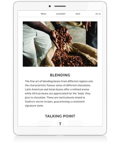
2. Irrelevant images
Are some images inconsistent with the style or content of the rest? Do they distract, or fail to add anything?
3. Visual ambiguity
Get a fresh pair of eyes on your course and have them narrate their initial reaction to each screen. Are they drawn to the wrong images or colors? Are they confused about the meaning that’s supposed to be conveyed by the page?
4. Navigation inconsistencies
If you’re editing navigation at a screen-by-screen level, it’s easy to introduce ambiguity. A ‘next’ button may be one color on one page and a different color on another. Use a style template for consistency.
5. Appropriate distraction
It’s fine for certain elements to draw your learner’s attention if they’re the main point of your screen. The issue with your page may not just be that a certain element is too prominent. If no visual draws attention, you may need to attract your learner’s eye to the key components using color, style, or size.
6. Misalignment
Your authoring tool should manage the padding and alignment of most on-page elements for you. Avoid letting anything in your main content look like it’s placed randomly: use consistent image dimensions and look out for small inconsistencies in font size, kerning, and line spacing.
7. Staleness
Sometimes, otherwise great visual design has simply passed its sell-by date. Maybe there are identifiable items or fashions in the shot that subtly date the image. Maybe people are just sick of seeing certain images. Either way, when in doubt, throw it out. Start from scratch and use what you know about current trends.
More from the blog:
‘9 Questions That Help Define Your eLearning Authoring Tool Needs’Don’t get stuck in a PowerPoint-shaped rut
When’s the last time you subjected your courses to the ‘PowerPoint test’? In other words, would your design work in PowerPoint with zero changes? Courses stuck in a slide-deck mindset can deliver good visuals, but the richer interactivity design available in an eLearning authoring tool allows you to add an important extra dimension to those visuals.
You can add interactivity and improve engagement with a generous sprinkling of any of the following:

- Add interactivity: eLearning deserves to be less static. Quizzes could be reworked to involve dragging and dropping answers into a list, for example.
- Implement parallax scrolling: A popular web design effect, parallax scrolling works by making background layers scroll slower than the foreground, which creates a sense of depth with attractive and non-distracting results.
- Use continuous scroll: If your course progresses quite linearly, continuous scroll eliminates the need to continuously click or tap ‘next’, and can be combined with transitions and parallax scrolling for a modern-looking design.
- Find alternative image layouts: Your authoring tool should have plenty of gallery-style options, such as filmstrips, accordions, carousels, comic strips, and image walls. These are more visually engaging and interactive than image options in a slide deck.
- Interactive images: Advanced authoring tools let you define clickable hotspots on an image that reveal in-depth information while taking up relatively little screen real estate. Zoomable images are another option, allowing learners to take a fine-detail look at a product or scene.

The limits of responsive design
It’s no secret that a significant volume of eLearning content is consumed on mobile devices and that a responsive authoring tool is the easiest way to create a course once and get great results on every screen and device type. However, responsive design rules do occasionally fail to account for some mobile-device needs.

- Device-specific display conditions: (where available in your creation tool) If you have a landscape image that uses hotspots, this can be more difficult to use on a cramped mobile screen. Device-specific display conditions can serve the information in a dropdown for these users while retaining the original experience for desktop learners.
- Mobile-first design: Try designing content with the limits of mobile in mind. One way to do this is by avoiding long sentences in dropdown menus, as they’ll often be cut off when viewed on mobile. Also, cut your lengthier video material into smaller chunks to suit the bite-size learning needs of people on the go.
Hand-picked for you:
‘Elearning Authoring Tools: Comparison of 7 Major Authoring Tools’Keep reading
In the full guide, ‘How to Create Visually Stunning eLearning: Design Tips That Work Every Time’, we’ve collected plenty of great tips focused on how to get eLearning visual design right. Continue reading the guide to find out:
- Why everything starts with your learning objectives and target audience
- Why you should set up a branded style template
- How to choose the right images for your courses
- The technical considerations for image and video hosting
Download the guide today
Complete the short form below to access the PDF:
