Most of us know about the benefits of truly responsive and adaptive eLearning design. Here are some of the secrets behind content that is truly responsive and adaptive and how you can easily maximize it for your learning.
With mobile devices now a key part of our daily lives, there’s no reason why truly responsive and adaptive eLearning courses shouldn’t be available to everyone who wants to access training on mobile devices.
The trouble is, some eLearning authoring tools out there are only able to deliver content in a fixed layout mode. They might support HTML5, but their content doesn’t respond and adapt correctly to different devices.
That’s bad news for the L&D teams who use them.
It obviously doesn’t make sense to build the same course multiple times in order for it to look perfect on any device. Learning teams also shouldn’t have to know the inner workings of HTML, the complexities of breakpoints, or a raft of other technical details that go on behind the scenes to create truly responsive and adaptive eLearning courses.
At Gomo, we understand that it’s a far better use of learning professionals’ time when they’re not forced to become programmers or spend hours thinking about different screen sizes.
Instead, they should be free to focus on high-quality, good-looking content that lands with learners—wherever and however they want to see it.
Adaptive and responsive eLearning courses: a brief overview
Responsive eLearning is a buzzword in digital design. In case you’ve never heard of it, truly responsive and adaptive eLearning means content that adjusts to fit any screen size without compromising on the user experience.
Adaptive design, meanwhile, allows the browser to detect the screen size of the device and display eLearning content that’s been tailored for optimal user experience using pre-designed templates.
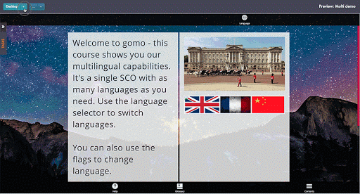
Our authoring tool, which is both adaptive and responsive, is based around columns on each page, with content moved into the layout by drag and drop. It’s the columns that drive Gomo’s responsive behavior.
When designing eLearning content, you can opt for a one, two, three, or four-column layout.
On a smartphone, the columns will be stacked vertically and the learner will scroll down the screen to access their content, just like on any responsive website.
How to check that your content is truly responsive and adaptive eLearning
Testing your content and making sure that it looks great on all device types and screen sizes is simple with Gomo. Our preview mode gives you the option to view your pages at different screen ratios (desktop, tablet, and smartphone), and in portrait and landscape modes.
This gives you a great sense of what your responsive eLearning courses will look like on all your devices, but it’s not the only way to test your courses with Gomo. To actually see it on a device, we offer simple sharing by QR codes.
Once you’ve turned the sharing option on, your colleagues and users can zap the course QR codes with a QR reader or, on devices with the latest updates, their camera app.
The truly responsive and adaptive eLearning course then pops up on your device and allow you to review exactly how it will look on your screen.

Why display conditions are so important to responsive Elearning courses
When you’re creating lots of different elements from one page to the next, at some point the content you’re portraying won’t naturally transfer that well to every screen. Large images like a world map, for example, simply don’t look great on a small smartphone screen.
The good news is that Gomo’s display conditions mean you don’t have to worry.
By setting different display conditions, such as ones specifically for users on smartphones, you can set conditions for your learning so that it suits the device in use.
Let’s say you have a complex diagram that needs to be large enough on the screen for learners to click around it. If you want it to take up as much screen space as possible, it’s likely to become quite difficult for users to interact with on the latest smartphone due to the reduced screen size.
But if you can re-orientate it so that it flows vertically, it’s going to be much more appropriate for a smartphone. You can set a display condition so the full-size version appears on desktop and tablet devices, whilst the adjusted version appears only on smartphone.

This will ensure the purpose and relevance of the content are retained, whilst optimizing the presentation to the target device.
A wide landscape image will look perfect on a desktop screen. Probably on a tablet too. But you can also do full justice to it on a smartphone by specifying a different way for it to display on mobile devices. Truly responsive and adaptive eLearning courses depend on display conditions, and Gomo makes their creation easy.
From day one, Gomo has been designed to provide truly responsive and adaptive eLearning courses and make it easy for L&D teams to design and distribute them. Responsive design is already a fundamental way of winning learner interest and increasing engagement. It’s only going to become more intrinsic to learning success as more and more people look to learn on mobile devices.