The design choices that L&D teams make, such as whether to use responsive or scalable design, can play a critical role in the success of learning programs. In this blog, we take a look at the meaning of both terms and offer a few tips on creating a seamless learning experience.
Having spent significant amounts of time painstakingly creating just the right content for your learners, no leadership or L&D team wants to be let down by poor design.
Most of us can remember the days, before the widespread introduction of game-changers such as HTML5, when web pages would often be difficult to navigate and perform erratically on different screens and browsers.
Designing mobile-first is not necessarily a future-proof approach, not least because future display sizes are unpredictable.
We can, however, say with certainty that the future will favor organizations whose learning design is flexible and capable of filling any screen beautifully. So how can you achieve this?
Responsive vs scalable design: How to hold learners’ attention
Smartphones and tablets are becoming increasingly popular platforms for learning.
Research has shown that people prefer to consume smartphone content in short bursts, with only 1% of UK smartphone users looking at online content in one go, and 61% preferring to browse in short sessions.
In the learning sector, this makes a bite-sized, microlearning approach preferable to lengthy learning modules, particularly when just-in-time or point of need learning depends upon being able to quickly access bursts of learning.
For this strategy to succeed, eLearning courses should have an instant visual impact and hold learner attention spans. Time-poor learners who only have pockets of time available are likely to be put off entirely by a clunky user experience. Responsive and scalable design techniques play a major part in ensuring this doesn’t happen.
What is scalable design?
Implementing scalable design has had significant benefits for organizations seeking to solve design challenges such as ensuring that images, videos and other objects do not become squashed on smaller screens.
By scaling the content on a page to fit the screen of the device being used, scalable design allows you to:
- Know exactly how your content will look on any screen
- Feel confident that your learning will look attractive and consistent across devices
- Save development time, such as testing content on dozens of different screens
What is responsive design?
Since the onset of the smartphone era and the sharp increase in non-desktop based browsing, developers have been finding increasingly effective ways to iron out design inconsistencies between devices and browsers.
One of these is a grid or column-based system, supported by coding that allows specific device types to be targeted.
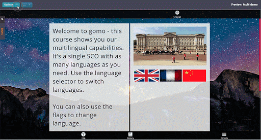
In Gomo’s case, you create content so that it appears in a layout of between one and four columns. These handle responsiveness and ensure, for example, that icons and buttons are easy to click, tap or swipe.
Responsive vs scalable design: How Gomo does it (for you)
Sometimes, simply scaling down content isn’t enough to satisfy the requirements of learners if they’re going to enjoy a seamless design experience.
Being able to make all the elements of your content fit on any screen is highly useful, but it’s not the same as creating a tailored experience.
That’s where Gomo’s display conditions come in. With display conditions, authors can easily create device-specific content, or specify different layouts according to the variables of a project.
A detailed graphic informing your learners about all your customer demographics might look impressive in 8k resolution on a full-size monitor, but become unusable when a learner looks at it on an iPhone on their commute to work.
In this predicament, you could use display conditions to specify that a simpler version of the graphic appears on smartphone screens, or replace it with text.
Responsive vs scalable design: which should you choose?
Scalable and responsive design approaches offer numerous benefits to organizations, and both can be said to make L&D professionals’ jobs easier.
They also intersect each other. Scalable design is a form of responsiveness, in that it responds to the dimensions of the screen the content is being delivered to.
Only responsive design, though, can be considered “true” mobile-first design, because it renders different layouts and automatically adjusts according to the screen size of the device the content is seen on.
Scalable design represents a less precise adjustment, but its single design and simple coding could be seen as “easier” to implement. However, choosing the right authoring tool should make the use of responsive and scalable design simple for your L&D team.
Using responsive and scalable design to reach your learners
The future of learning is mobile-friendly, but building different versions of a course for different devices is an inefficient use of time that L&D teams could be using to concentrate on creating impactful learning content.
With Gomo’s responsive design capabilities, you only need to build a course once in order for it to look perfect on all screen sizes and orientations. Whatever device your learners use, great design for your courses is a given.
